
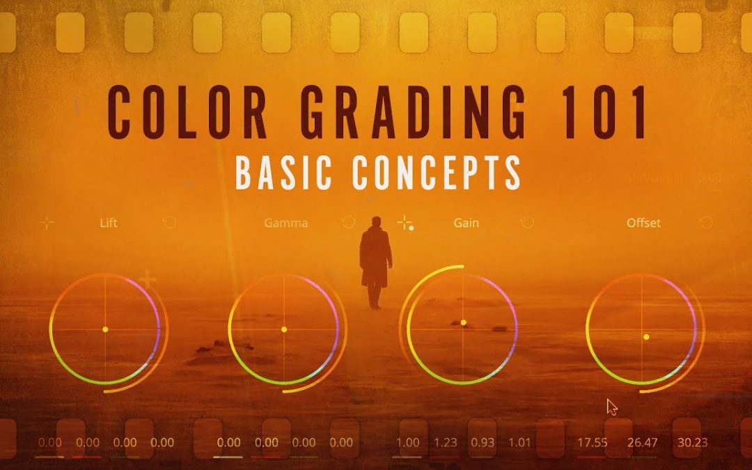
Color grading can transform your videos from ordinary to extraordinary, enhancing the mood and storytelling power of your visuals. For beginners looking to dive into this essential aspect of post-production, understanding the fundamentals is key. In this article, we’ll explore practical tips for color grading that will help you elevate your footage, regardless of your experience level. Whether you’re aiming for a cinematic look or a vibrant aesthetic, these straightforward techniques will set you on the path to mastering the art of color grading.
What essential tools do beginners need for color grading?
Beginners need a good monitor, color grading software, a color wheel, reference images, and a calibrated environment for effective color grading.
What are the essential tools I need for color grading as a beginner?
As a beginner in color grading, it’s essential to equip yourself with a few key tools that will help you achieve vibrant and professional results. Start with a reliable video editing software that offers robust color grading features, such as DaVinci Resolve or Adobe Premiere Pro. Invest in a good quality monitor that supports accurate color representation, ensuring you see true colors during the grading process. Additionally, consider using color grading plugins that can enhance your workflow, like FilmConvert or Magic Bullet Looks. Finally, familiarize yourself with color wheels, scopes, and LUTs (Look-Up Tables), which are invaluable for making precise adjustments and achieving a cohesive look in your projects. With these tools in hand, you’ll be well on your way to mastering the art of color grading.
How can I achieve a cinematic look in my color grading?
Achieving a cinematic look in color grading begins with understanding the fundamental principles of color theory and the emotional impact of hues. Start by selecting a color palette that conveys the mood of your film. Soft, muted tones often evoke a sense of nostalgia, while vibrant colors can create energy and excitement. Utilize tools like color wheels and LUTs (Look-Up Tables) to establish a consistent look that aligns with your vision, ensuring that each scene feels cohesive and intentional.
Lighting plays a primordial role in how colors are perceived, so pay close attention to the lighting setup during filming. Natural light can impart a soft, organic feel, while controlled studio lighting allows for more dramatic contrasts and shadows. When grading, consider enhancing highlights and deepening shadows to create depth. This dynamic range adds a layer of sophistication, making your visuals more engaging and immersive for the audience.
Finally, don’t underestimate the power of contrast and saturation adjustments. A well-balanced image often features bright highlights, rich midtones, and deep shadows, offering a three-dimensional quality. Use selective color grading to emphasize specific elements or to guide the viewer’s eye to focal points, enhancing storytelling. By combining these techniques, you can transform your footage into a visually captivating experience that resonates with cinematic storytelling.
What are some common mistakes to avoid when starting with color grading?
One of the most common mistakes in color grading is neglecting the importance of a well-calibrated monitor. Without proper calibration, colors can appear drastically different between your editing suite and the final output, leading to discrepancies that can undermine the visual integrity of your project. Additionally, many beginners tend to overdo their adjustments, pushing colors too far in one direction or applying excessive effects. This can create an unnatural look and detract from the storytelling aspect of the visuals.
Another frequent pitfall is failing to establish a clear grading strategy before diving into adjustments. A disorganized approach can result in inconsistent color palettes and a lack of coherence throughout the project. It’s essential to take the time to analyze the footage and define the mood or atmosphere you want to convey. By setting a clear vision and maintaining consistency, you can enhance the emotional impact of your work while avoiding the chaos that often accompanies haphazard grading techniques.
Master the Art of Color Correction
Color correction is an essential skill for anyone looking to enhance their visual storytelling. Whether you are a photographer, videographer, or digital artist, understanding how to manipulate colors can transform your work from ordinary to extraordinary. By mastering the basics of color theory, including the relationships between hues, saturation, and brightness, you can create images that evoke emotion and convey your desired message with clarity.
To effectively correct colors, start with a solid foundation in your editing software. Familiarize yourself with tools such as curves, levels, and color wheels, which allow for precise adjustments. Practice balancing the overall color temperature and correcting any inconsistencies to ensure your images have a cohesive look. Additionally, experiment with creative color grading techniques to develop your unique style, setting your work apart from the competition.
Finally, always keep your audience in mind while color correcting. Different colors can elicit varying emotional responses, so consider the message you want to communicate. Use color correction not only to enhance the aesthetic quality of your work but also to reinforce the narrative. By combining technical skills with a thoughtful approach, you can master the art of color correction and elevate your creative projects to new heights.
Transform Your Footage with Simple Techniques
Unlock the full potential of your videos with simple yet effective techniques that can elevate your footage from ordinary to extraordinary. Start by mastering basic editing skills, such as cutting and trimming clips to create a seamless flow. Enhance visual appeal with color correction and filters that set the mood and tone of your story. Incorporate smooth transitions and engaging text overlays to keep your audience captivated. With just a few adjustments, your raw footage can transform into a polished masterpiece that resonates with viewers and leaves a lasting impression.
Elevate Your Visuals: A Beginner’s Guide
In today’s digital landscape, captivating visuals are essential for grabbing attention and conveying messages effectively. Whether you’re a budding entrepreneur, a social media enthusiast, or simply someone looking to enhance personal projects, understanding the fundamentals of visual design can elevate your content to new heights. Starting with basic principles, such as color theory and composition, can help you create engaging visuals that resonate with your audience.
Investing time in learning about various design tools can also significantly enhance your visual presentations. User-friendly platforms like Canva or Adobe Spark provide templates and resources that simplify the design process, allowing even beginners to create professional-looking graphics. Experimenting with different styles and formats not only boosts creativity but also helps in discovering what resonates best with your intended audience.
Finally, remember that consistency is key to establishing a recognizable visual identity. By developing a cohesive color palette, typography, and imagery style, you can create a strong brand presence across all your platforms. Regularly assessing and refining your visual content will ensure it remains fresh and relevant, ultimately leading to increased engagement and a lasting impression on your viewers.
Unlock the Power of Color in Your Projects
Color is a powerful tool that can transform your projects from ordinary to extraordinary. By understanding the psychology of color, you can evoke specific emotions and create a lasting impact on your audience. Whether you’re designing a brand logo, developing a marketing campaign, or enhancing a website, the right color palette can convey your message more effectively and foster a deeper connection with your audience.
Incorporating color strategically allows you to guide viewers’ attention, highlight key elements, and establish a cohesive visual identity. Experimenting with contrasting shades can create excitement, while complementary colors can promote harmony and balance. By unlocking the potential of color in your projects, you not only enhance aesthetic appeal but also improve communication and engagement, making your work more memorable and effective.
Mastering color grading opens up a world of creative possibilities for beginners eager to enhance their visual storytelling. By focusing on the fundamentals—understanding color theory, experimenting with different software tools, and practicing with various footage—you can elevate your projects to new heights. Embrace the learning process, stay inspired by the work of others, and don’t hesitate to explore your own unique style. With dedication and practice, you’ll develop the skills to bring your vision to life, transforming ordinary footage into captivating visual experiences.
