
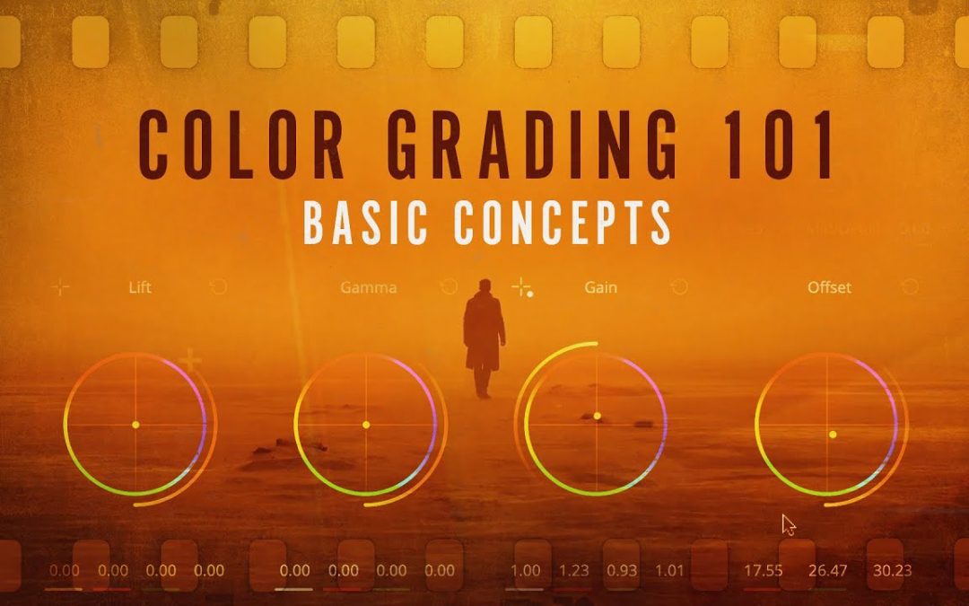
Color grading is an essential aspect of video production that enhances the visual storytelling experience. For beginners, understanding the fundamentals of color grading can seem daunting, but it opens the door to creating more dynamic and engaging content. In this article, we’ll break down what you need to know about color grading, from the basic concepts and tools to practical tips that can elevate your projects. Whether you’re a budding filmmaker or a content creator looking to refine your skills, mastering color grading will help you bring your creative vision to life.
What are the basics of color grading for beginners?
Color grading basics include understanding color theory, adjusting contrast and saturation, using software tools, and creating a consistent mood or style for your visuals.
What are the fundamental principles of color grading?
Color grading is an essential aspect of video production that enhances the visual appeal and emotional impact of a scene. Understanding the interplay between highlights, shadows, and midtones is esencial for achieving a balanced and dynamic image. Highlights are the brightest parts of the image, while shadows represent the darkest areas, and midtones serve as the bridge between the two. Properly manipulating these elements allows for greater depth and texture, drawing viewers into the narrative.
Hue, saturation, and luminance are equally important concepts that further refine the color grading process. Hue refers to the actual color itself, while saturation measures the intensity or purity of that color. Luminance, on the other hand, determines the brightness of a color. By skillfully adjusting these three factors, colorists can create a specific mood or atmosphere, guiding the audience’s emotional response to the content.
Incorporating these six key concepts into your color grading workflow can elevate your video projects to new heights. Mastering highlights, shadows, midtones, hue, saturation, and luminance not only enhances the visual storytelling but also allows for creative expression. As you delve into the world of color grading, these foundational elements will empower you to craft compelling visuals that resonate with your audience.
What is the primary guideline in color grading?
In the world of color grading, the foundation of a polished final product begins with proper color correction. This essential first step ensures that your video is visually cohesive and sets the stage for the artistic enhancements to come. By addressing exposure, white balance, and color accuracy, you create a neutral baseline that allows for more creative freedom in the grading process.
Achieving correct exposure means adjusting the brightness levels to avoid overexposed highlights or underexposed shadows, which can detract from the overall quality of the footage. Similarly, correcting the white balance is esencial; it ensures that colors appear natural and true to life, preventing any unwanted color casts that can mislead the viewer’s perception. These adjustments lay the groundwork for a seamless transition into the more stylized aspects of color grading.
Once your video is properly color-corrected, you can dive into the more artistic elements of grading, enhancing mood and style. This is where the magic happens, as you manipulate colors to evoke specific emotions or highlight particular themes. By prioritizing color correction first, you not only enhance the visual integrity of your project but also empower your creative choices during the grading phase.
What are the fundamental terms used in color grading?
Color grading is a fundamental aspect of visual storytelling, influencing how viewers perceive an image or scene. The process revolves around three primary elements: hue, saturation, and brightness. Hue refers to the actual color present in the image, laying the groundwork for the overall color palette.
Saturation takes this a step further by determining the intensity of these colors. A higher saturation yields vibrant and striking visuals, while lower saturation can create a more muted, subdued atmosphere. Mastering saturation allows creators to evoke specific emotions and set the tone for their work.
Finally, brightness plays a esencial role in color grading by affecting how light or dark the overall image appears. Adjusting brightness can enhance details in shadows or highlights, creating depth and dimension. Together, these three components—hue, saturation, and brightness—enable artists to transform their visuals and convey powerful narratives through color.
Master the Art of Color: A Step-by-Step Approach
Color is a powerful tool in design, capable of evoking emotions, creating harmony, and guiding the viewer’s eye. To master this art, it’s essential to understand the basics of color theory, including the color wheel, complementary colors, and color harmony. By grasping these foundational concepts, designers can make informed choices that enhance their work and resonate with their audience. This knowledge lays the groundwork for experimenting with colors effectively, leading to more dynamic and engaging designs.
Once you have a solid grasp of color theory, the next step is to practice creating color palettes. Start by selecting a primary color that embodies the mood or message you wish to convey. From there, explore the shades, tints, and tones that can complement or contrast with your chosen hue. Experimentation is key; try creating monochromatic schemes for a sophisticated look or triadic palettes for vibrant energy. Document your process and refine your choices, ensuring that each palette aligns with the intended emotional response.
Finally, apply your color knowledge to real projects, whether digital or print. Pay attention to how different colors interact with various elements, such as typography and imagery, and adjust as necessary to achieve balance and legibility. Seek feedback from peers or mentors to gain fresh perspectives on your color choices. By continuously practicing and refining your skills, you will not only master the art of color but also elevate your overall design work, creating pieces that are visually stunning and impactful.
Unlock Vibrant Visuals: Your Beginner’s Toolkit
In today’s digital age, captivating visuals are essential for engaging your audience and conveying your message effectively. Whether you’re a budding content creator, a small business owner, or just looking to enhance your personal projects, understanding the basics of visual design can set you apart. With the right tools and techniques, you can transform your ideas into striking images that resonate with viewers, making your content more memorable and impactful.
Start by familiarizing yourself with user-friendly graphic design software. Programs like Canva and Adobe Spark offer intuitive interfaces and a wealth of templates, allowing you to create stunning visuals without a steep learning curve. Explore color theory to understand how different hues evoke emotions and influence perceptions. Knowing how to combine colors harmoniously can elevate your designs and create a cohesive look that draws attention.
Finally, don’t underestimate the power of high-quality images and typography. Utilize free resources like Unsplash or Pexels for stunning photographs that enhance your message. Pair these visuals with clean, readable fonts to ensure your text complements rather than competes with the imagery. By mastering these fundamental elements, you’ll unlock a world of vibrant possibilities, enabling you to craft compelling visuals that captivate and inspire your audience.
Transform Your Footage: Simple Techniques for Stunning Results
Transforming your footage into a visually captivating masterpiece doesn’t have to be a daunting task. With a few simple techniques, you can elevate the quality of your videos and engage your audience like never before. Start by mastering the art of lighting; natural light can dramatically enhance your scenes, while soft artificial lighting can create a mood that resonates with viewers. Additionally, incorporating dynamic camera angles and smooth transitions can add a professional touch that keeps your footage flowing seamlessly.
Editing is where the magic truly happens. Utilize color correction tools to enhance the vibrancy of your visuals, ensuring that each frame pops with life. Don’t underestimate the power of sound; a well-chosen soundtrack can evoke emotions and draw your audience deeper into the narrative. By combining these techniques, you can effortlessly transform ordinary footage into stunning visual stories that leave a lasting impression. With a little creativity and practice, your videos will not only capture attention but also inspire and entertain.
Color grading is an essential skill for anyone looking to enhance their visual storytelling. By understanding the basics of color theory, mastering software tools, and experimenting with different styles, beginners can transform their footage from ordinary to extraordinary. Embracing this creative process not only elevates the aesthetic quality of your work but also allows for deeper emotional connections with your audience. Dive into the world of color grading and unlock the full potential of your visual narratives.
